Our Top 10 Graphic Design Trends for 2018
Now that the first quarter of the year is almost finished, we at PSD Wizard decided to pick out our favorite graphic design trends for 2018.
We held a survey with our staff members to get a tally of our company’s total opinion. The survey contained a list of 20+ design trends that are popular today. All 23 of our respondents are either web designers or front-end web developers.
10. Negative Space Typography
Starting off our countdown with 8 votes, we chose Negative Space Typography to take this spot. Mixing typography and negative space together as a composition provides a distinct look that works for many logos, posters, labels, and much more. The text stays legible and brings background elements to the foreground. It can range from simple to drastically sophisticated.
I made this example below by turning the photographic element, which is by Ben Blennerhassett of Unsplash, into a clipping mask over large text.
9. Double Color Light
With 10 votes at 9th, Double Color Light gives a colorful “avant-garde” look that’s absolutely stunning. The Double Color Light is achieved by either by actually taking a photo with two sources of light or separating and then manipulating the color channels.
For my example, I created it by cutting out the model in the stock photo, separating the color channels, and then manipulating them to achieve this look. The photograph is by Allan Filipe Santos, also from Unsplash.
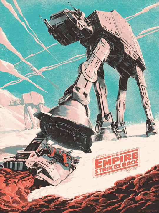
8. Hand-Drawn Illustrations
You can’t go wrong with Hand-Drawn Illustrations. At 8th with 11 votes, illustrated designs are timeless and may never go out of style. Illustrations have had a very prominent role throughout history. Illustration goes back to ancient history and is the forefather of graphic design, which was coined in 1922. That is also the golden age of illustrated movie posters that were hand-painted.
In modern days, Illustrations still play a big role. It’s still widely popular and found in magazines, movie posters, t-shirts, and much more. Our own site is covered with hand-drawn illustrations that I made with paper and ink.
As an excellent example, here’s an awesome alternate poster for Star Wars: The Empire Stirkes Back by Juan Esteban Rodriguez!
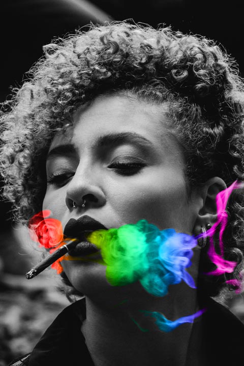
7. Color Gradients
This one is interesting. Taking 7th with 12 votes, the Color Gradients effect provides a look that actually started around the early 2000s. Then in 2016, it made a comeback but was much improved as new technologies and methods have been developed since. Instagram started it that year with what is now their current logo. Personally, I think it’s strangely appealing and looks best when the gradients are used with a grayscale element, namely photographs. This way, the grayscale element becomes emphasized or vice-versa.
The example below is made simply by using a lasso tool to select the smoke from the cigar and then adding a color gradient on a new layer set to “color” mode. It’s simple and looks nice. Stock photo is by Talles Alves from Unsplash.
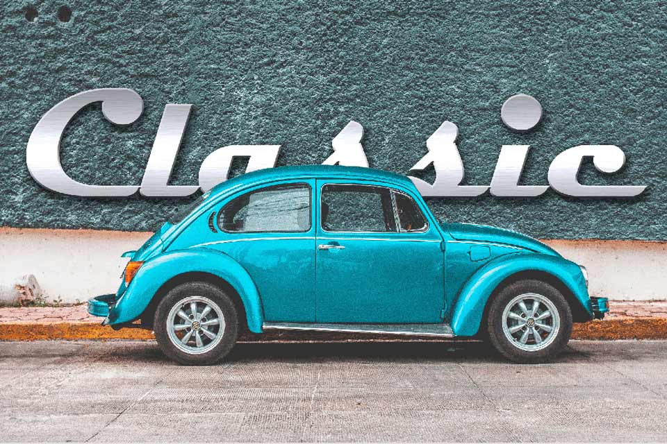
6. Typography and Photography Fusion
With 13 votes, using typography as an element within a photographic composition looks amazing. In contrast to Negative Space Typography where the text can be used to emphasize photographic elements, this technique merges photography and typography together. Looks great, doesn’t it?
This is regularly used in magazine covers such as Time Magazine, People’s Magazine.
I made the example below with the Volkswagen Beetle by taking a piece of the roof of the car and layering it over the text to make it look as though the car was in in-front of the text. The photo is by Erik Odiin of Unsplash.
5. Responsive Logos
A little more on the technical side, responsiveness plays an important role in web design. Responsive websites are no longer a feature, they’re a requirement because of technological growth and the use of different devices. And if a logo is meant to enforce a brand, it should definitely be responsive too. These logos were redesigned to maintain a recognizable connection to the brand at any screen size. This gets 13 votes from us at PSD Wizard.
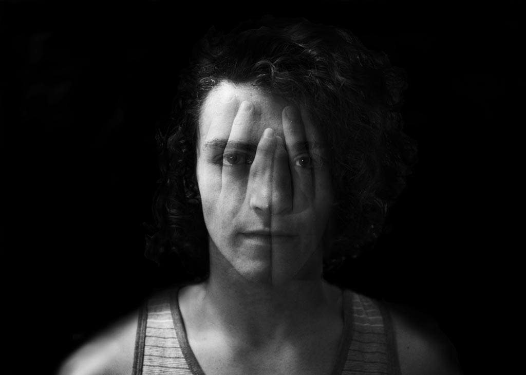
4. Color Channels Distortion Effect
Having some similarity to the Double Color Light, the Color Channels Effect gives a look that feels holographic or almost like an illusion. Using color channels distort images is a new technique that is becoming quite popular. And with 14 votes, we love it!
Similarly made to the Double Color light effect, this is designed by splitting the color channels and then manipulating them. But instead of making it look like a light source, it looks like another layer of the same or similar image to create the distortion. I made the example below that way with a stock photo by Daniel Garcia from Unsplash.
3. Creative Typography
We are now at our top 3 with 15 votes. Creativity in type may never go out of style. A great imagination and know-how of techniques to create eye-catching type design, but still keep the text legible, is the kung-fu of design.
This type of design has no specific method of creation. There are so many ways to make it that it would be impossible to describe all of them.
Below are a couple amazing examples by Jenifer Blanco Mozon examples. I love these!
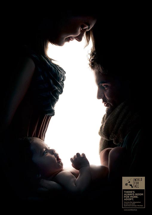
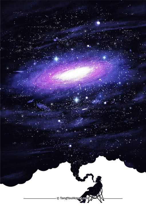
2. Negative Space Designs
Yup, Negative Space is on our list again and reached our top 3 with 18 out of 23 votes. Using empty space as a design element to form shapes is a very appealing trend that’s. By making shapes from the empty space and putting it in the foreground, you can create emphasis on the background and immediately bring it forward. Or you can get even more creative and use those shapes together to make the composition.
Take a look at these examples by World For All Co. and Tang Yau Hoong below. They’re great!
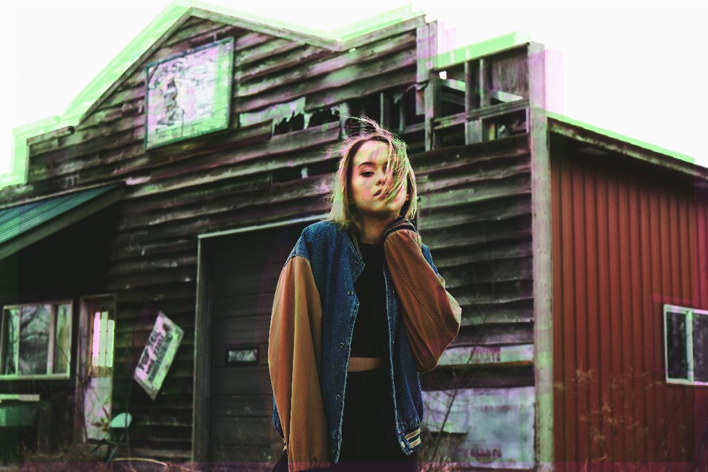
1. Double Exposure
With 19 votes, PSD Wizard’s favorite graphic design trend of 2018: Double Exposure. This design technique has been going on for years now, but it still holds its popularity. It still manages to impress a big audience, including us.
Double Exposure is artistic in nature and originates from when photographers accidentally take more than one photo on the same film exposure. This created a “ghost” effect of sorts. It was accidental back then, but now it’s definitely with intention.
Check out these wonderful examples by Elijah Hiett, from Unsplash, and Christoffer Relander.
And that concludes our top 10 graphic design trends for 2018. What are your favorites? I have a bias towards hand-drawn illustrations. But if I were to choose from these 10, my favorite is the Typography and Photography Fusion.
Visit the new PSD Wizard here!
Image sources:
Creative Typography SampleUp Next